Accent Lighting Ratio Calculator
Balance artwork, wall features, shelves, and niches against your ambient lighting with target ratios such as 3:1, beam spread, fixture distance, reflectance, accent count, and dimming level.
Accent Lighting Ratio Estimate
| Accent goal | Ratio to ambient | Typical use | Visual result |
|---|---|---|---|
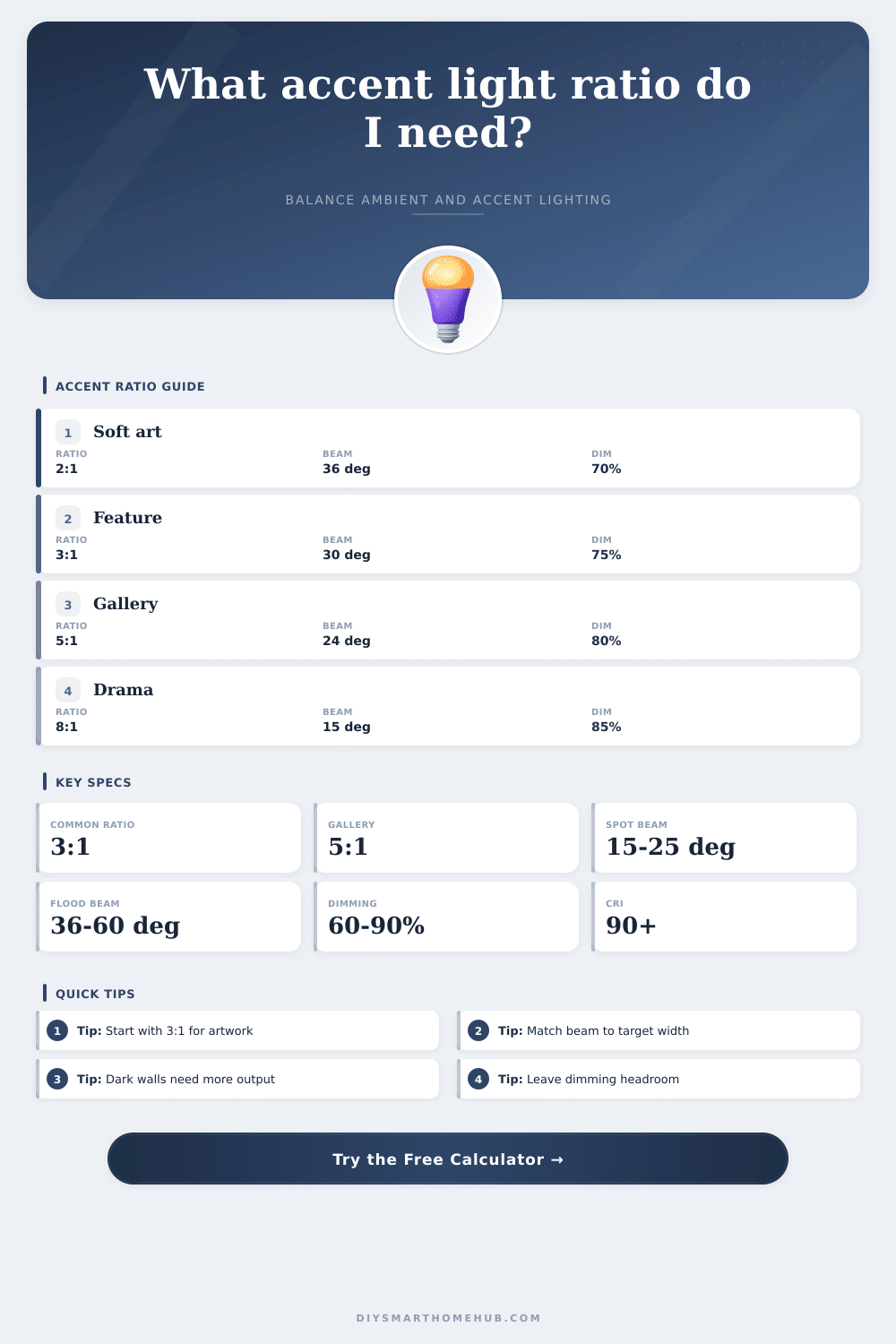
| Subtle lift | 1.5:1 to 2:1 | Shelves, soft bedrooms, quiet niches | Visible but not dominant |
| Standard accent | 3:1 | Most artwork, mantels, decorative walls | Clear focal point |
| Gallery emphasis | 5:1 | Framed art, feature objects, entry walls | Strong contrast |
| Dramatic contrast | 8:1 to 10:1 | Texture walls, sculpture, display niches | High-drama focal light |
| Beam angle | Footprint at 4 ft | Footprint at 6 ft | Best fit |
|---|---|---|---|
| 15° narrow spot | 1.1 ft diameter | 1.6 ft diameter | Small art or object highlight |
| 24° spot | 1.7 ft diameter | 2.6 ft diameter | Medium framed artwork |
| 36° narrow flood | 2.6 ft diameter | 3.9 ft diameter | Portraits or stacked frames |
| 60° wide flood | 4.6 ft diameter | 6.9 ft diameter | Texture wall or broad wash |
| Surface condition | Calculator factor | Lighting impact | Planning note |
|---|---|---|---|
| Dark matte wall, brick, deep frame | 1.28 | Needs about 28% more accent output | Use tighter beams or more fixtures |
| Medium color or texture | 1.15 | Moderate absorption | Good baseline for feature walls |
| Light neutral wall or artwork | 1.00 | Baseline output | Works well for 3:1 artwork |
| Glossy or glass-faced artwork | 0.86 | May appear brighter with less output | Watch glare and reflected hotspots |
| Preset | Ambient zone | Accent target | Fixture approach |
|---|---|---|---|
| Gallery Wall 3:1 | 240 sq ft, 3600 lm | 6 ft × 4 ft artwork | Two 30° track heads |
| Single Canvas 5:1 | 180 sq ft, 2700 lm | 4 ft × 3 ft canvas | One narrow spot or two smaller heads |
| Dark Brick Feature | 300 sq ft, 4500 lm | 10 ft × 8 ft wall | Four floods with dark-surface factor |
| Bedroom Picture Light | 140 sq ft, 1500 lm | 5 ft × 2 ft art strip | Soft picture light at lower dim |
This calculator estimates accent balance for planning scenes and fixture output. Final aiming should be checked in the room because frame depth, trim shape, and wall texture can change the visible result.
In this space, you hang some art up and it just sits there, looking flatter then flat. It’s washed out, those muddy colors; and the frame dissapears into the wall. Why? Because of the way lighting work: You’ve got ambient light that fills the space so you’re not tripping over things in the dark, and then you have accent light that calls attention to object.
Figuring out how to balance those two kinds of lights take more intuition than most people realize. A calculator turns your general sense of how bright something should of be into real-world fixtures and lumen output. These are contrast ratios. Starting with contrast ratios. Interior designers frequently suggest a three-to-one ratio is typical for artwork. That’s to say that the light cast on your canvas should be about three times the level of overall room light.
How to Light Art Properly
Sounds easy enough? Light levels don’t tend to spread out evenly. A track head will focus its intensity into one square foot; a ceiling downlight scatters its energy over thirty. Plugging in your target area and zone size, the calculator do the maths. No need for conversion or coefficient guesswork.
People don’t realize how much surface finish matter. Exposed brick walls or dark matte paint soak up light. A spec sheet may say something about five hundred lumens but that figure assume a reflective white wall. A deep charcoal accent wall will require much higher output levels in order to provide the same level of visual impact.
Because of this, the tool prompt you to enter reflectance. For dark surfaces it bumps up the needed lumens; for glossy ones, which tend to bounce light around aggressively, it go down.
That brings us to Beam Angle. Amateurish vs. It is professional. Do you have lots of coverage in an area (wide flood beam) but lose some strength over a greater distance? Aim a 60 degree spread on something tiny and most of that energy won’t touch it. You will be washing your drywall instead. Conversely, tighter beams concentrate the energy where needed. The table below make it easy to see which diameters to expect for each beam angle.
Bright doesn’t mean much. Containment matters. You don’t want light pool extending beyond the frame, maybe just outside the outer edge. But no bleed through to the wall beside it.
Most rooms are not lit at full brightness; we dim the lights when relaxing or having dinner. Running your scene at half dimmed (fifty percent) means your carefully planned three-to-one turn into a still-good one-point-five-to-one. This is where all the careful planning goes away, and the art recedes into the background noise again. Plan for an average scene between seventy and eighty percent. Running it at full dims the room while maintaining the contrast goal. This keeps things flexible and gives you enough headroom so that lowering the lighting levels for comfort preserve the visual hierarchy.
Distance to fixtures also play into things. The closer something gets to you, the more intense it becomes (by the inverse square law) (but as you move a source further away), the beam spreads wider while the intensity drop off. For example: a track head hung three feet from the wall will have a much stronger effect than a fixture with an identical bulb hung six feet away. Change how far the fixture is from the wall and watch what happens: moving the hardware closer or further away changes how much light hits your target. It is a little thing. Yes, but important when you’re working with low eaves or high ceilings, where architecture limit option choice different than desire does.
Beyond lumen count, color rendering matter, too. Although a bulb could have adequate light output while having low CRI, it doesn’t do well at rendering colors such as blue or red correctly. No matter how bright a lamp is, cheap sources makes art look dull. Combining high color quality with adequate output means that the focus point truly get attention in the proper way.
It’s not simply a matter of getting a checkmark in the box on a spreadsheet. It’s about establishing a visual anchor capable of holding its own against other stuff happening around it. Done well, your eyes will go directly to the place you wanted them to, without even knowing that you led them there.