Gallery Wall Spacing Calculator
Plan frame gaps, edge margins, total art area, centerline placement, and hanging point coordinates for a clean gallery wall layout.
| Frame | Column | Row | Frame Center | Hook Point | Top Edge |
|---|---|---|---|---|---|
| Calculate to show hanging points. | |||||
| Gallery Situation | Typical Gap | Edge Margin | Best Use |
|---|---|---|---|
| Tight modern grid | 2 to 2.5 in | 4 to 8 in | Matching frames and clean rows |
| Balanced gallery wall | 3 to 4 in | 6 to 12 in | Mixed art with controlled rhythm |
| Large feature frames | 4 to 6 in | 10 to 18 in | Oversized pieces that need visual air |
| Hallway run | 2.5 to 3.5 in | 4 to 8 in | Narrow walls viewed while walking |
| Above furniture | 2.5 to 5 in | 8 to 16 in | Sofa, console, bed, or dining wall |
| Style | Spacing Formula | Centerline Rule | When It Works Best |
|---|---|---|---|
| Aligned grid | Equal horizontal and vertical gaps | Group center on selected height | Matched frames or same-size prints |
| Single row | Width sets the visible rhythm | Frame centers share one level | Hallways and furniture-backed rows |
| Vertical stack | Height and hanger points dominate | Stack center on selected height | Narrow wall returns and niches |
| Salon block | Use average bounding rectangles | Center the full outside block | Mixed sizes that still need order |
| Stair-step rhythm | Equal gaps with rising centers | Each row steps by frame height plus gap | Landings and sloped visual paths |
| Hardware Type | Measure To | Typical Hook Drop | Spacing Note |
|---|---|---|---|
| Sawtooth hanger | Notch center | 0.5 to 1.5 in | Good for small frames in tight grids |
| Wire hanger | Pulled wire peak | 1.5 to 4 in | Measure after the wire is tensioned |
| D-rings | Ring center pair | 2 to 4 in | Keep paired holes level across rows |
| Keyhole slot | Slot lock point | 0.25 to 1 in | Needs precise side-to-side marks |
| Cleat rail | Rail catch line | 1 to 3 in | Useful for wide or heavy frames |
| Project Type | Wall Width | Frame Mix | Common Layout |
|---|---|---|---|
| Above sofa | 84 to 120 in | 6 medium frames | 3 columns x 2 rows |
| Hallway run | 90 to 144 in | 4 to 6 slim frames | Single row |
| Entry wall | 42 to 72 in | 3 medium frames | Triptych or vertical stack |
| Dining wall | 108 to 156 in | 8 to 12 mixed frames | Salon block |
| Nursery grid | 60 to 84 in | 9 small frames | 3 columns x 3 rows |
A gallery wall doesn’t have to be a complicated mathematical equation. Instead, it can be thought of as just layout exercise. There’s no reason to panic and avoid putting holes into your drywall wall.
Here is the real deal: your eye pay attention to the rhythm, not the details of each individual frame. Once you create a visual beat, then where exactly you put that item becomes secondary. Set up the layout and pay attention to spacing. Not the selection. The calculator handle all that geometry for you. Simply input dimensions of your walls (and how many frames) and let it do the math; from margin, gap, down to hanging point itself.
How to Plan a Gallery Wall
Canvas is defined by wall size (width and height). Density is determined by how many frames there are and how column are arranged. Too dense, with too many frames jammed into a thin hallway (without changing columns), won’t feel right. Negative space should work just as hard as art.
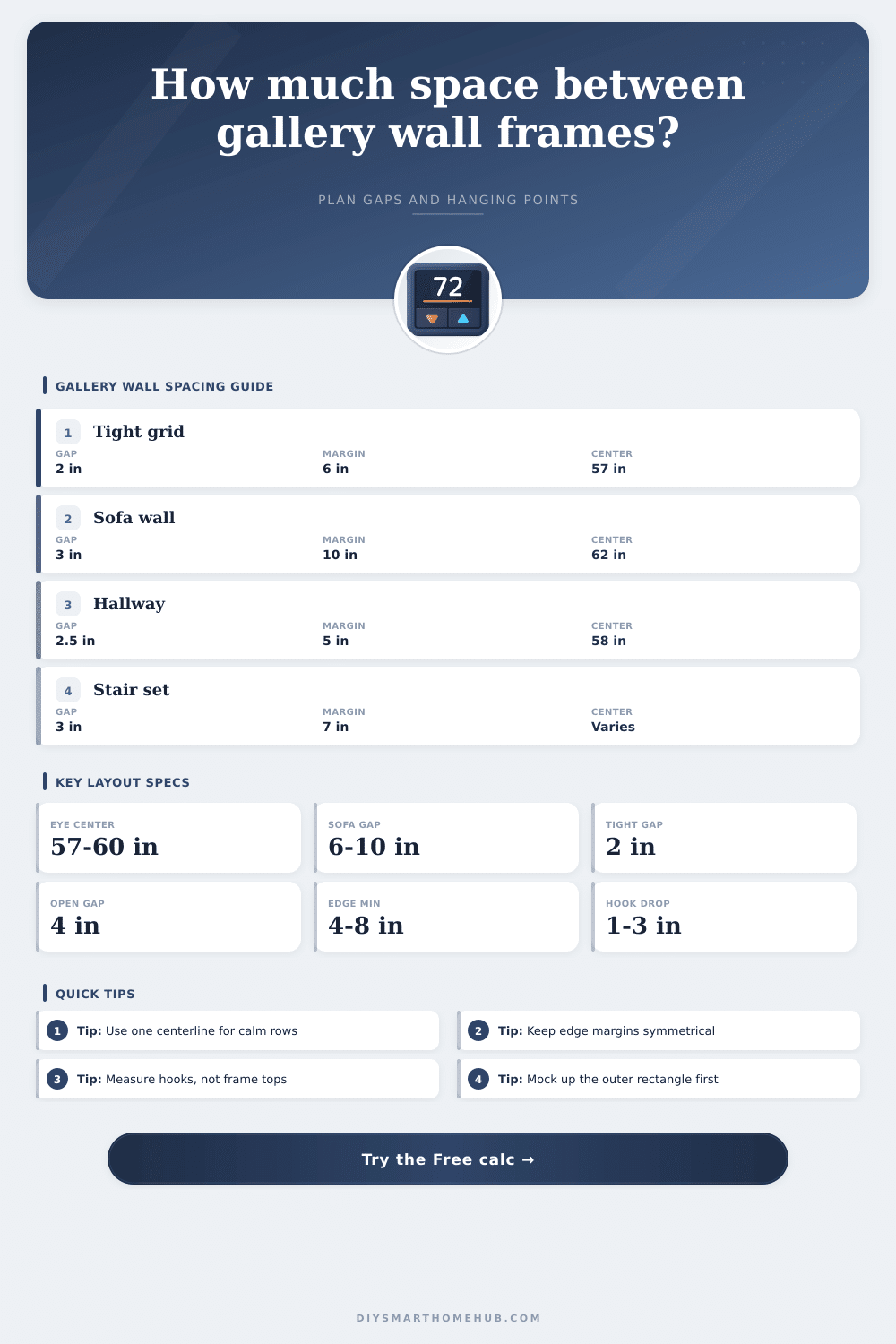
The most crucial variable in keeping everything on the ground is the centerline height. In the past I’ve heard interior designers aim for center of grouping to be at fifty-seven inches off the ground (which roughly corresponds to typical eye-level height in humans). That way the artwork isn’t floating too high (or too low next to the adult-sized sofa). Above a bed or console table, however, you could increase it a bit while still allowing space between frame and nearby furniture. Just move the centerline up/down using the tool, then you’ll get a sense of how it affects the grouping before picking up your hammer.
The rhythm of the grouping are provided by the spaces between frames. Tight: Two inches feels tight and moddern, good for matching frames that look like a single unit. Leave three or four inches of breathing room to allow for air space between each picture, which is more forgiving if you are mixing styles and sizes. Edge Margins: These tie the arrangement into the perimeter of the wall. Too narrow on the sides and the whole thing get chopped off. Too wide and the arrangement seem like an island floating in a sea of empty space. The spacing between the pictures should match edge margin so the eye flows smoothly from one image to the next.
Most people don’t realize how much complication comes into play with hanging hardware until they’re in the middle of drilling! Depending on what kind of hanging hardware you use, distance from the top of frame to the hanging point will vary. For example, a keyhole slot hangs almost flush to the frame top, whereas a sawtooth hanger or D-ring can hang up to two inches below the frame top if tensioned. Make sure you measure out how far your hardware drops and account for it when marking off your hole locations. This little bit of info makes or breaks the alignment.
Begin by taping out perimeter rectangle of your layout on the wall with painter’s tape. Does that seem like the correct proportion to the wall, and does it feel balanced? From there, add the nails in order of your determined hook locations; don’t eye-ball them as you go along one-by-one. Keep stepping back to assess the vertical balance. Adjust spacing a bit at a time if one row seems too heavy or light compared to others. You’re aiming for a sense of intentional harmony, not robotic precision. When the rhythm feel good, the individual holes aren’t so important anymore. The eye will see it all as one whole thing.
You should of trust the math for the framework and trust your taste for the finishing tweaks.