Living Room Lumens Calculator
Estimate layered living-room lighting with seating zones, ambient/task/accent balance, ceiling height, wall reflectance, beam spread, dimming target, and CRI preference.
The calculator normalizes the three layer percentages, then increases task lumens when seating-zone demand is higher than the slider share.
Living Room Lighting Estimate
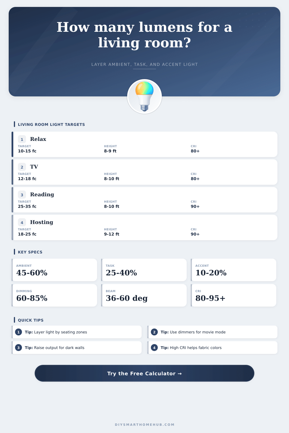
| Living-room use | Target foot-candles | Best layer emphasis | Typical room result |
|---|---|---|---|
| Relaxed lounge or conversation | 10 to 15 fc | Ambient with soft accent | Comfortable evening brightness |
| TV room with low glare | 12 to 18 fc | Dim ambient plus wall accent | Balanced screen contrast |
| Family room, games, and daily use | 18 to 24 fc | Ambient and task mix | Flexible all-purpose light |
| Reading, crafts, or detailed tasks | 25 to 35 fc | Task lights at seats | Higher local visibility |
| Beam type | Common spread | Best use | Calculator effect |
|---|---|---|---|
| Narrow accent | Under 25° | Art, shelves, fireplace texture | Needs more installed lumens |
| Spot or track | 25° to 35° | Focused seats or accent zones | Moderate beam adjustment |
| Medium downlight | 36° to 50° | General living-room coverage | Near baseline efficiency |
| Wide flood | 51° to 70° | Even ambient fill | Best room coverage factor |
| Condition | Lighting impact | Adjustment range | Use in calculator |
|---|---|---|---|
| Dark walls, rugs, or upholstery | Absorbs more light | Add 12% to 22% | Raises target lumens |
| Light walls and neutral surfaces | Reflects light across seating | Baseline to -8% | May reduce installed output |
| Ceilings above 10 ft | More distance to task plane | Add 10% to 26% | Raises fixture lumens |
| Low glare TV layout | Benefits from dimming headroom | 60% to 75% target | Increases installed capacity |
| Preset | Room size | Seating plan | Lighting priority |
|---|---|---|---|
| Cozy Condo Lounge | 13 ft × 12 ft | Two zones, one reader | Soft balanced layers |
| Open Plan Hosting | 24 ft × 18 ft | Four zones, two readers | Higher ambient and task |
| Dark Wall Media Room | 18 ft × 16 ft | Three zones, one reader | Dark-surface correction |
| High Ceiling Great Room | 26 ft × 22 ft | Five zones, three readers | More installed headroom |
When it comes to lighting a living room, it’s less about the number of watts and more about how you handle the contrast: Do you need enough light to see where you’re going, yet keep corners soft so you don’t feel like you’re in a doctor’s office? People tend to just get a fixture based off the bulb power rating, but that typically means you end up with either a gloomy or sterile feeling space.
The calculator above do the math for you once you clarify what you actualy do in a space and what kind of comfort zone is right for you. This moves the conversation away from lumens and toward real-world comfort zones. Layering is at the heart of the idea. What’s important here isn’t just filling a space with light; it’s carving out light in various planes.
How to Light Your Living Room Correctly
There’s ambient lighting to set a mood. There’s task lighting for things like playing board games or reading. Then there are accent to add visual interest by drawing attention to art or textures. Then, with a few simple sliders, you can adjust how much of each kind of lighting there is.
Again, this sounds minor but it makes a difference. Get too ambient, and suddenly your room has no depth. Too focused on task lighting, and all of a sudden you’re left with pools of bright light that look more like an office breakroom then a place to lounge around.
The majority of your calculation are driven by seating areas. Not only do you want light on the floor below the furniture, but also on the occupant. Two armchair and a sofa in one corner of the room make one conversation zone. If there is a separate reading chair somewhere else, it has its own target area.
To accommodate this, the calculator lets you specify separate active zones alongside the overall area. That way you can avoid extra costs to account for dark areas, something many people often tend to do. By locating fewer light where required, you gain better control.
The adjustment factors will reflect how wall color and ceiling height affect your calculations: Light-reflecting glossy finishes and pale paint colors will multiply the starting estimate, whereas dark colors absorbs more light. A darker-colored area might require an even higher output to achieve equivalent brightness because of that absorption, so the tool tacks up the output accordingly (you’re fighting both physics and design!). A pale room can be stretched if you’ve got glossy floors and walls, but that doesn’t mean “just add more bulbs.”
How is that light hitting those surfaces? That’s beam spread. Dramatic spots has narrow beams, but they have hard shadows nearby. Wide floods create softened transitions from lit to unlit areas. Why do most of us tend toward medium spreads for our main coverage? Because the chart on the page makes it clear: you give up some punch for uniformity.
Homeowners tends to default to wide-angle fixtures because they appear safer. A combination of tighter accent beams and wider ambient ones tends to result in a richer visual experience. You can’t skip the dimmer in today’s living room.
A good portion of the day doesn’t call for static lighting. A bright white light during the day will help with cleaning Saturday morning, while a warm low-level glow would of been great for a movie at 10 pm. That’s where the dimming target comes into play. Specifying your desired dimming percentage will help determine how much overhead you has to ensure that lowering the light doesn’t sacrifice color fidelity or clarity.
The final aspect of color rendering is subtler, yet important: a higher CRI makes your space feel more comfortabley. With a higher CRI number, the light renders colors closer to their natural state, your skin tone becomes warmer and all those fabrics become richer. If accuracy is most important for you, you can even use the tool to give that priority. Low-CRI lights will ultimately make a room feel lifeless and flat, though you probably wouldn’t know right away. It’s a small investment in quality that’ll pay off each day.
When it’s done well, good lighting isn’t noticeable. It shouldn’t be about the fixtures themselves. You want to know if the lighting allow for easy reading without straining your eyes, or if it highlights the beauty of the furnitures. Take the estimates as a base and use adjustable lamps to experiment first before permanently wiring anything in place.
Begin by making things bright, then dim them back until your eyes shows you where the dark spots are. Make the room adjust to you, rather than force yourself to adjust to it.